Development Log 4 - Liam McIntosh
The past couple of weeks or so has been solely dedicated to updating visuals, making new systems and tweaking existing ones for the UI.
Player UI
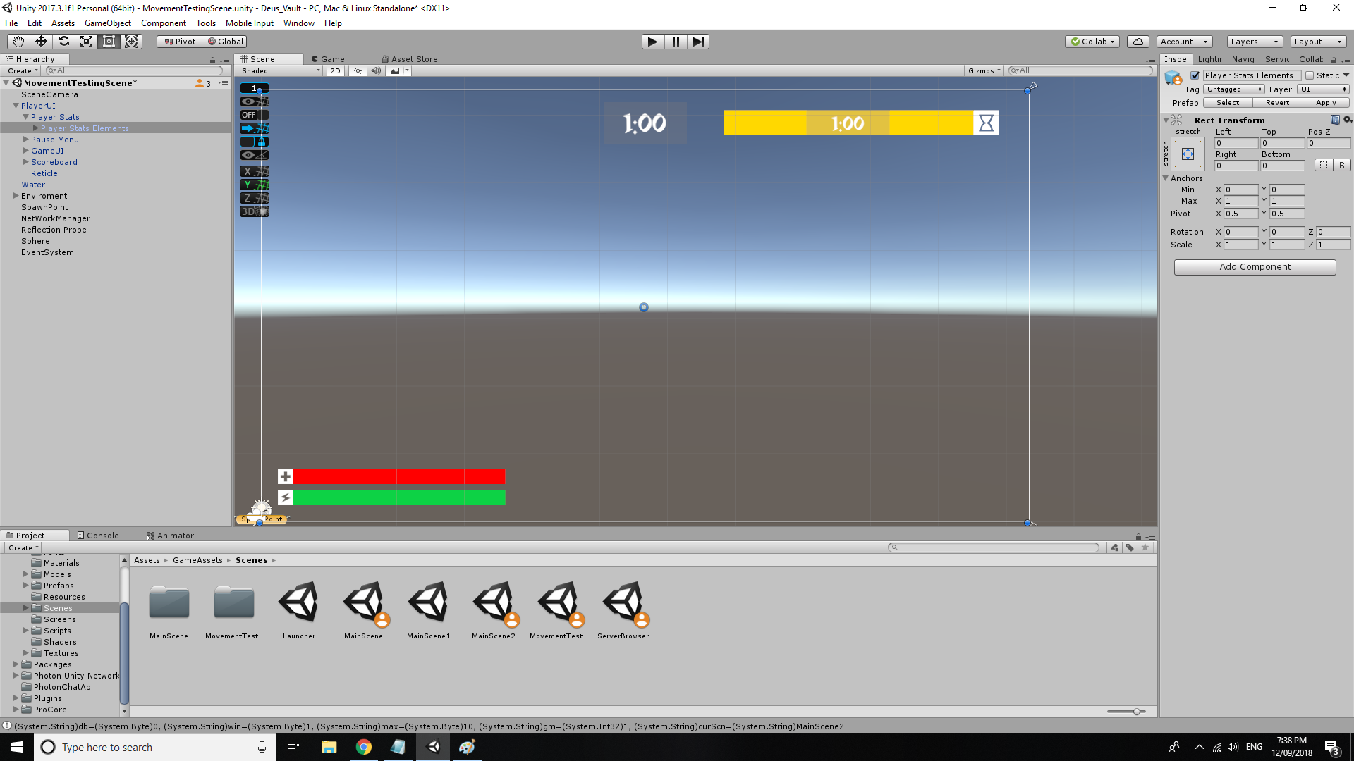
The first thing I worked on was overhauling the player UI. Just so it looked a little cleaner and was ready for proper sprites which are going to be implemented later once Rhys finishes them. My goal for the UI was to stay as clean and as minimalist as possible.I didn’t want to UI to distract from the visuals of the game because Rhys and Tom have been working hard to make this game look as great as possible. Its purpose is purely to express information to the user and be as purposeful as possible. With that being said I still want it to have some style. I drew inspiration from games like Destiny and Nier Automata which both have super clean, purposeful but also aesthetically pleasing UI. To achieve this desired aesthetic I tried to use simplistic shapes and colors throughout all the elements. I used square shapes and positioning in all the buttons, panels and overlays. The use of color was kept quite simple with the use of whites, grays and blacks with the limited use of the color read to highlight important aspects. I also added this nice fade to UI elements to hide them when they are not needed by the user. If your health and endurance hasn’t changed the UI associated to that fades out and only fade back in once you’re damaged.

Start Menu
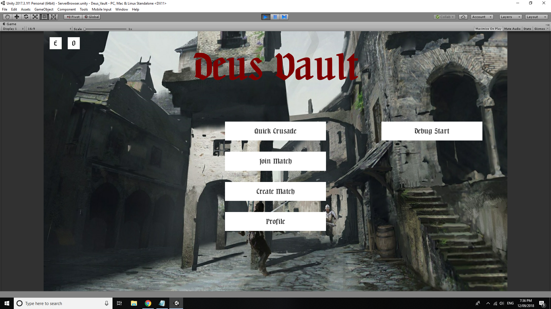
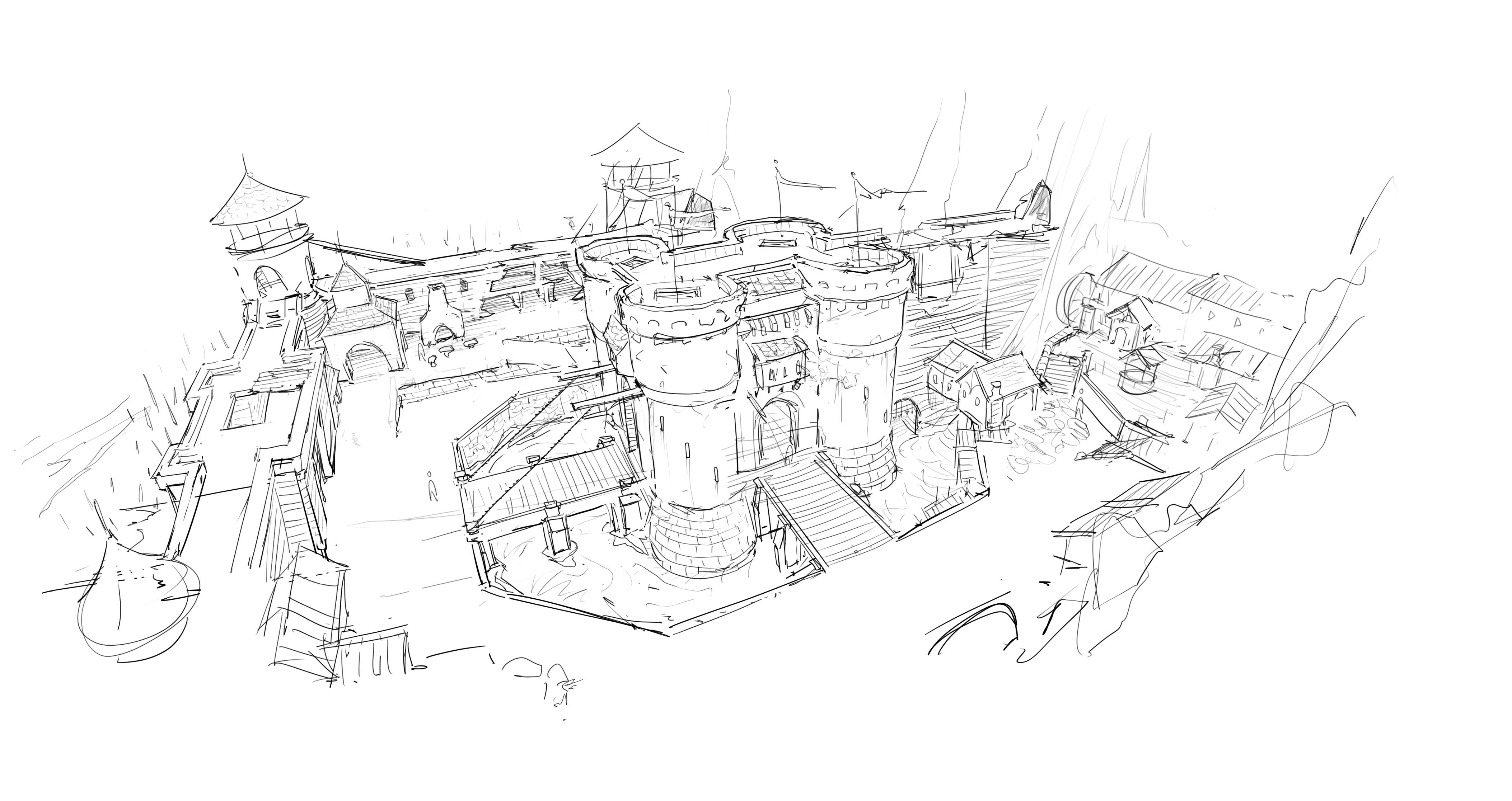
The biggest job of this prior weeks had to be the start Menu because it had many screen, options and buttons. Lucky I had some existing infrastructure from the old game before Photon. However a lot of it wasn’t usable for the new systems which meant that I had to cut out, move and restructure a lot of it. I had to build new systems from scratch, create all the UI screens in the engine and ensure that they were all being shown at the right moments in time. To give some variance to the screens I added Rhys’ amazing concepts pieces, so that players had something nice to look at when they were navigating the menus. I was also super excited to finally be able to add Julian’s main theme to the game which is turning out great.

I was able to work quite closely with Rupert in this endeavor. He was in control with all the network functionality and the start menu had to interface with this. Which meant that my code and his code had to communicate with each other. This proved to be a little difficult because there were times where our code clashed. However it was a great experience because I had never really worked with another programmer on the same aspect of a a game before.
Game UI
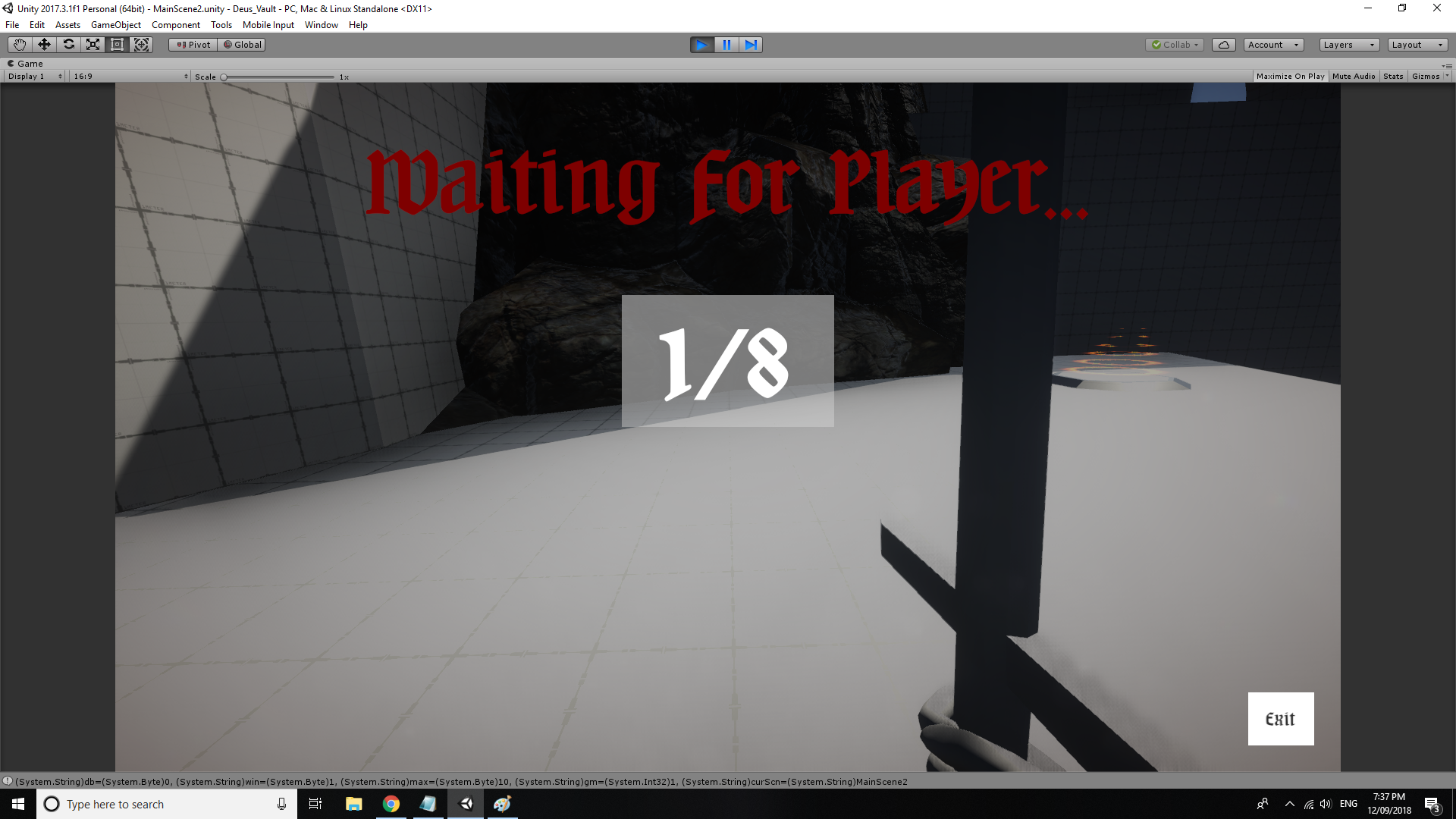
The most recent thing I also worked on was the UI for the game modes and game structuring. I had to make a start screen that waited until there was a minimum amount of player before the game starts. I also made some more player UI like a bar to track your progress in the Crusade game mode , a round timer and I had to alter the scoreboard for both game modes. Again I had to work closing with Rupert on this because he was also in control of the game mode functionality.

Where to next
There are still a couple more things I want to implement into the UI but once that's all done ill be moving on to tweaking the player movement and attack behaviors and them adding the sounds and additional UI sprites as they come in form my teammates.
- Liam McIntosh
Deus Vault
If Quake and Chivalry had a child
| Status | In development |
| Author | DeusVault |
| Genre | Fighting |
More posts
- Development Log 7 - Rhys GriffithsOct 13, 2018
- Development Log 6 - Rhys GriffithsOct 13, 2018
- Development Log 5 - Rhys GriffithsOct 13, 2018
- Development Log 4 - Rhys GriffithsOct 13, 2018
- Development Log 7 - Tom ForwoodOct 11, 2018
- Development Log 7 - Liam McIntoshOct 10, 2018
- Development Log 6 - Liam McIntoshOct 03, 2018
- Development Log 6 - Tom ForwoodOct 02, 2018
- Development Log 5 - Tom ForwoodSep 19, 2018
- Development Log 5 - Liam McIntoshSep 19, 2018

Leave a comment
Log in with itch.io to leave a comment.