Deus Vault
Development Log 6 - Rhys Griffiths
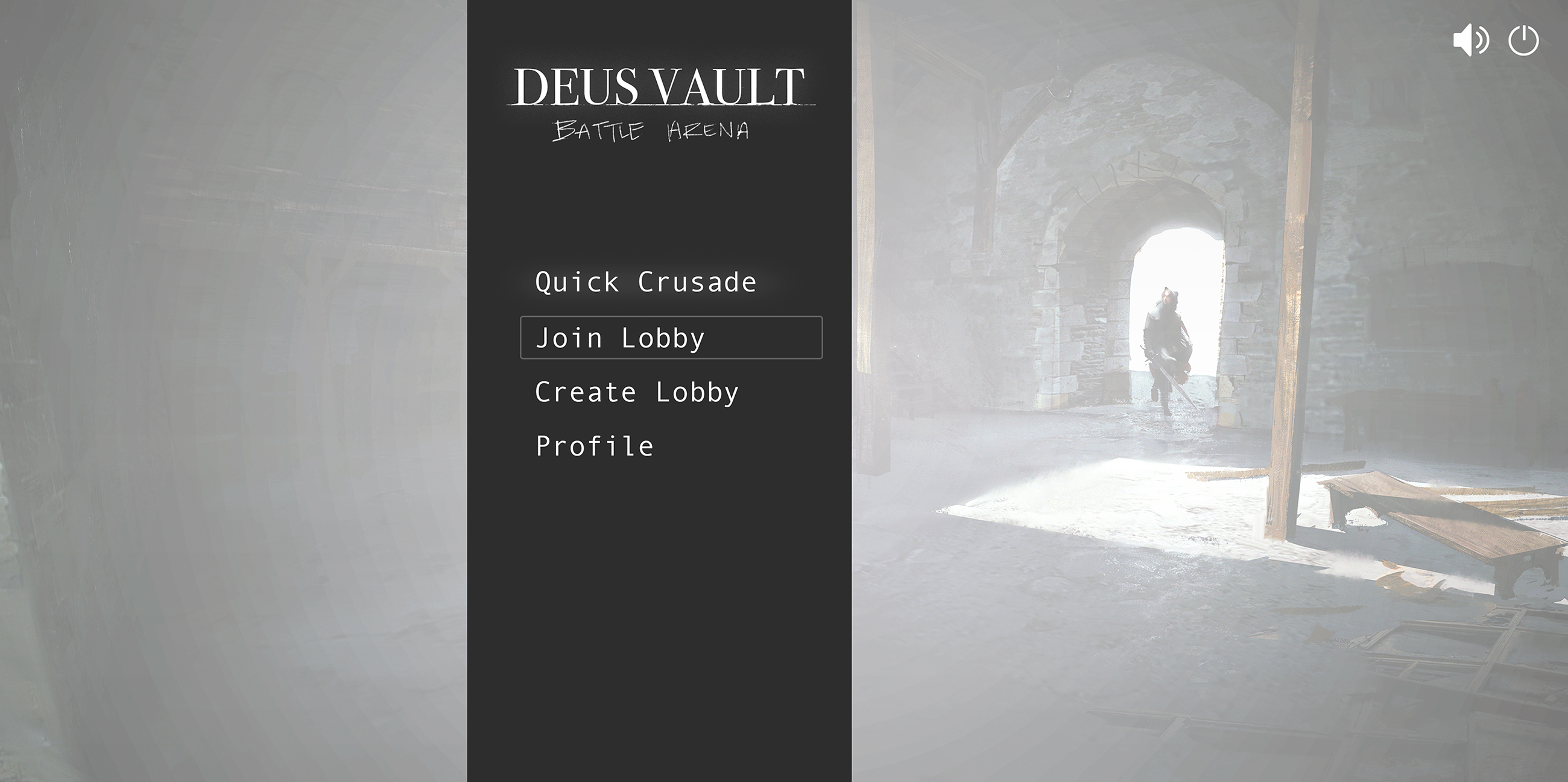
Our UI was standing out to me as a big problem - Liam and I had discussed our vision for the UI before and we both agreed that a sleek, minimal UI design would work well for our game. I knew I had the design skills to do something like this, so I created some comprehensive UI concepts for Liam to work from, as well as individual PNG assets that he could use to construct the UI inside Unity.
Doing my research, I looked at Destiny as a game with a UI to aspire to. I constantly referred to screenshots from Destiny for wisdom on how to keep the design clean and minimal.
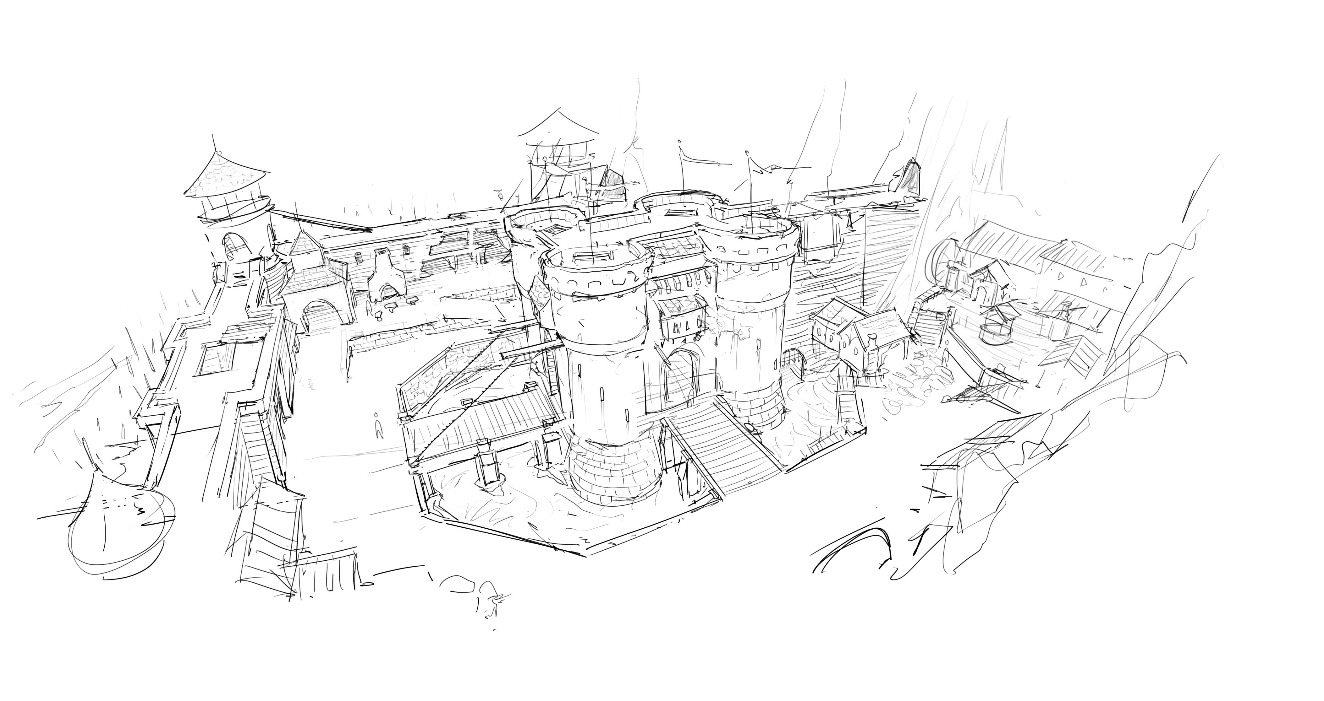
It made sense to use the concept art I’d already make as backgrounds for the menu and loading screens too - however they were far too obtrusive. I washed out the images so that there was enough detail left to hold visual interest without overpowering the text.
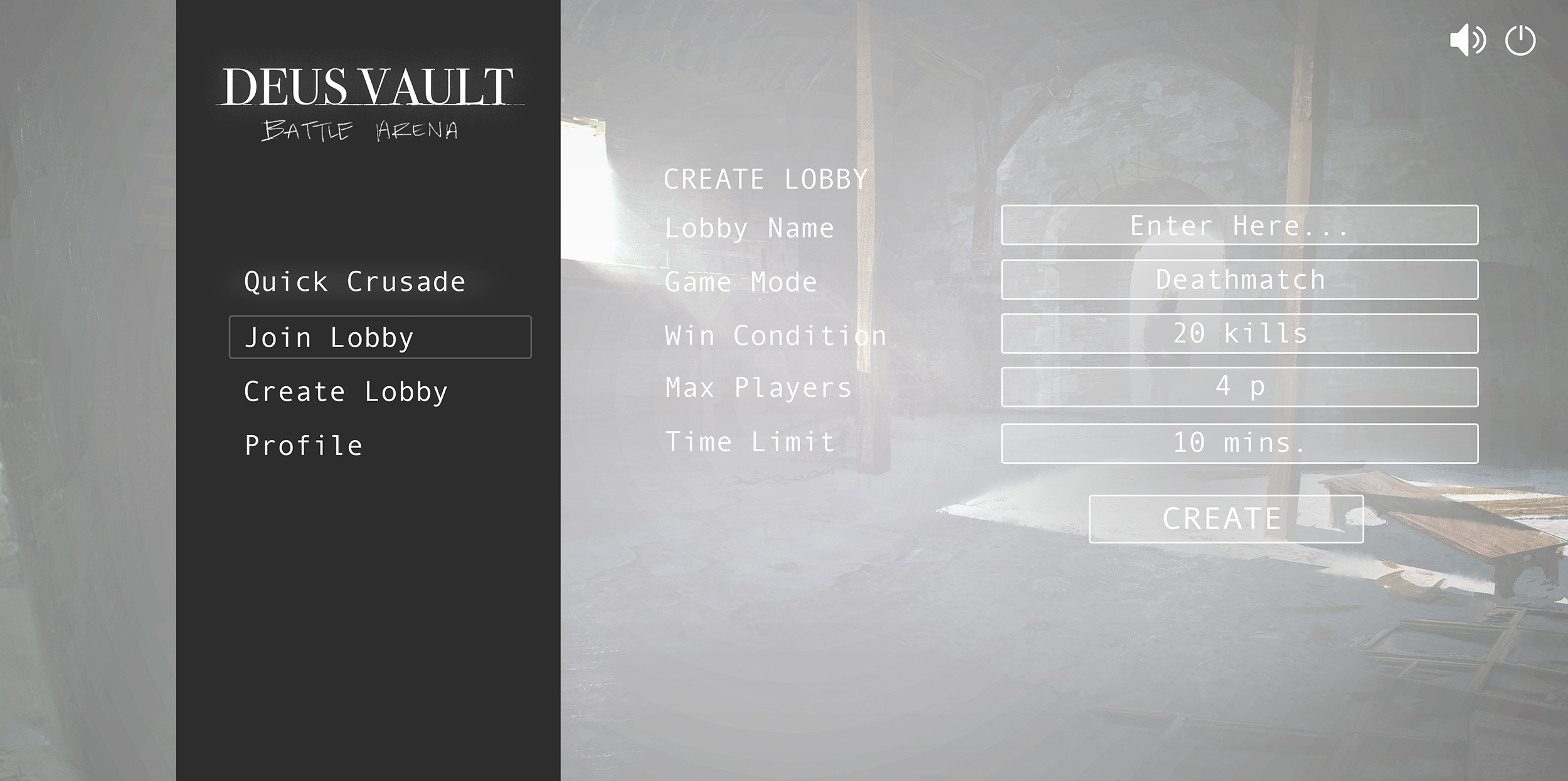
Establishing some rules in the UI was important to me. Consistency is key. Anything clickable needed to have a white box around it so that players would understand it is clickable. Fonts kept to just 2 - one for the game title and logo, the other for menu items. Any words that were unnecessary, I replaced with buttons.
We want the player to ideally play the game by just clicking 'Quick Crusade' so I put a permanent glow beneath it - hopefully new players will click that straight away. More advanced players who are looking to play custom games, or games with specific friends, can create or join private lobbies.

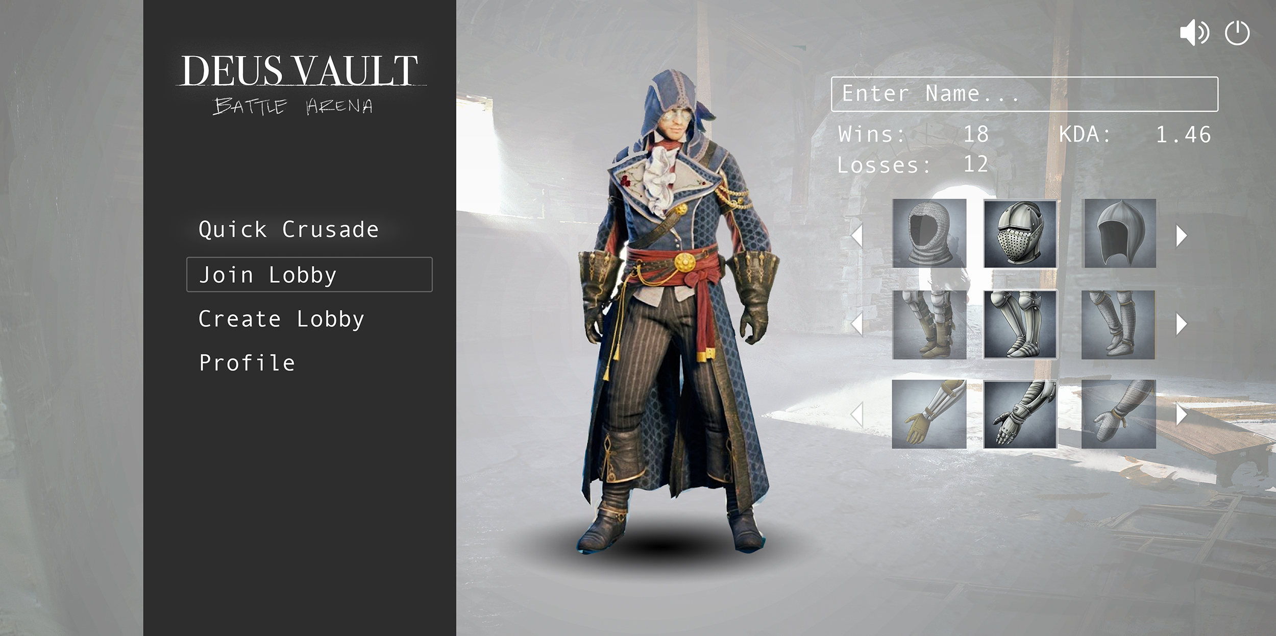
Since we had a long term goal of player’s being able to customise their armour and weaponry, I designed that too, so that it wouldn’t be added as an afterthought later and create design issues. I used placeholder images. Again, any graphic design was kept low key and minimal. As little clicking required as possible - rather than selecting and dragging specific armour etc, the player is restricted to just clicking arrows.
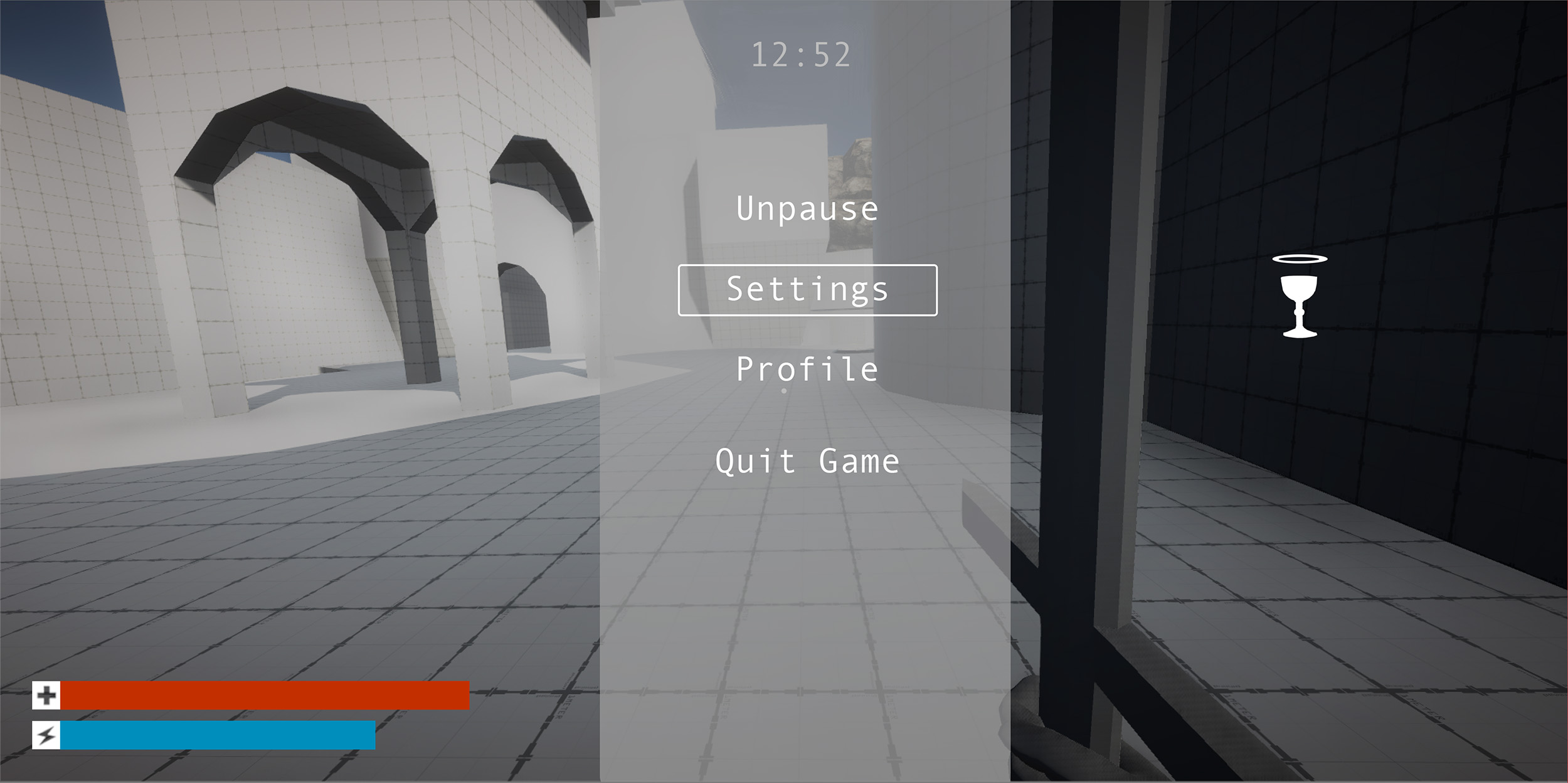
In game, I wanted the pause menu to reflect the vertical bar on the main menu page, as well as the same layout for selecting options - these conventions will make the player feel familiar with the game quickly, and understand new menus that are presented to them without having to explain them. I also chose nicer colours and replaced the font.
The icon of the grail to the right shows the location of the player holding the holy grail, wherever they are on the map.
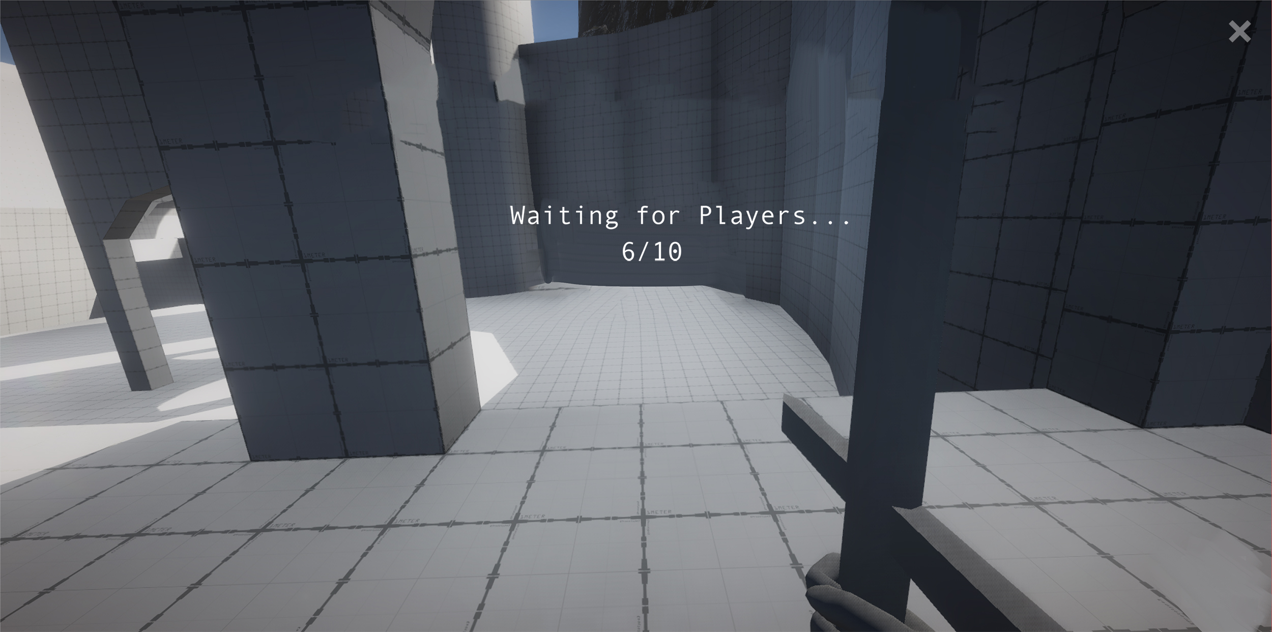
And lastly, reworking the loading screens to be consistent with the rest of the game.
Leave a comment
Log in with itch.io to leave a comment.